
NFL Playoffs Infographic Usability Fail
I’m going to make my first post on this here blog about user experience and more specifically the usability of the graphics discussing the NFL playoffs. User experience and watching American football are other passions of mine in addition to programming in Ruby. I feel like its appropriate to expand the scope of my blog to include usability but that regularly including football would be scope creep ;)
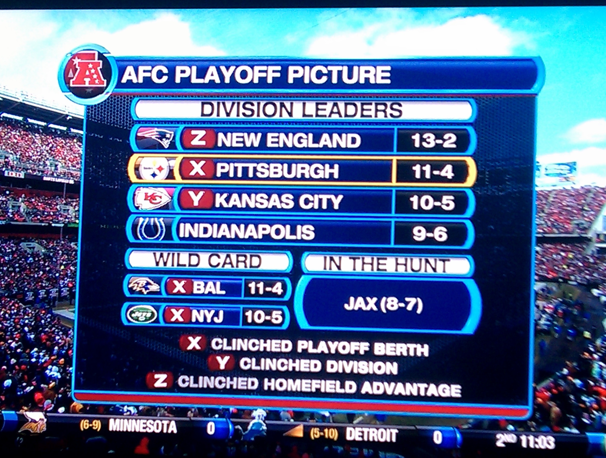 Infographic on CBS during the Steelers-Browns game
My beef today is with the infographics that use x, y and z when discussing the NFL playoff picture. The use of these arbitrary letters is oddly ubiquitous throughout various media outlets’ coverage of who has made the playoffs in which method, and using the letters makes it more difficult to understand the situation. Following my reasons for why this is so confusing are some suggestions as to how this information could be presented more clearly.
Confusion
I did some research into the reasons behind using these letters and all I could find was this question and its answer that seemed to be confusing the letters I’m interested in with the ones given to various receivers. I also asked Dave, the person with the most sports trivia knowledge that I know, why these letters are used, and he said he had no idea. Please let me know in a comment if there is a reason I’m unaware of.
One potential reason is that these are just meant as footnotes. However, if that is the case, why wouldn’t all these networks just use an existing, well known standard for footnotes such as superscript numbers, numbers in brackets, asterisks or daggers?
That these independent entities are not using an existing footnote standard and are instead using the same letters x, y and z might indicate that there is a universal meaning. If I spent time memorizing the meaning of these letters in this context, then I would know what the letters mean across all the networks and I wouldn’t have to read the footnotes.
However, there is NO universal reason for the use of these letters because the letters don’t have the same meaning across networks! Some networks are even augmenting this “standard” with an actually standard asterisk, used in the same manner as the letters (why not add another letter??)
| Source | x | y | z | * |
|---|---|---|---|---|
| NFL.com | Playoff Berth | Wild Card | Division | Division and Home Field |
| ESPN | Playoff Berth | Wild Card | Division | Division and Home Field |
| CBS Sports [1] | Playoff Berth | Division | First-round Bye | Home Field |
| NBC Sports | Playoff Berth | Division | Conference | |
| Fox Sports | Division and Home Field | Division | Playoff Berth |
[1] - also note that the meanings of the letters used on CBS Sports’ website differ from the meanings used in the graphic above that I saw used on TV by CBS!! [2]
[2] - see what I did there with those nice, standard footnotes?
So partly because the letters have no inherent meaning and partly because the letters have different meanings from different sources, when trying to figure out the information a graphic like this is telling me, I end up starting to scan from the top, then jumping to the bottom, then back up to where I was reading, then to the next line, then back down to the bottom, etc. I inevitably forget what a letter means even if I have already seen it, and once the graphic is removed from the screen I still feel like I have no idea who is definitely in or out of the playoffs. Unless you are deliberately trying to make it confusing, leaving the user devoid of the message you say you are trying to send is infographic fail.
Improvements
Whenever trying to improve the usability of software, the User Experience team at the company where I work will usually identify the target user and then pop the “why” stack to discover the target user’s goals. I have found this to be quite an effective way to get started, so let’s do that here.
For once, I am the user– and I would say that I am a consistent but casual fan. I enjoy watching the games and I do so on a regular basis, and because I watch on a regular basis I am familiar with most of the terms and events of football. I’m not a superfan who knows absolutely everything about the game, nor am I a purely social fan who only watches games incidentally and who likely knows less about the game in general. I’m also not an announcer, coach, player, or associated with the NFL in any official capacity (each of those could be potential users of this graphic as well).
I also discussed this topic with my partner-in-crime Jake, who I would put in the same category of casual-consistent, which doubles my sample size of users.
I’d also posit that our type of fan should be the target type for the networks. I would bet that most fans are casual-consistent (definitely more than superfans). Also, we should be the most valuable to marketers due to the consistent part (superfans are consuming everything about football from everyone already, so you’re not going to gain market share by wooing them) and that you’d want to grow this type of fan by converting the social fans (although not alienate or annoy the superfans). More tenuously, I’d hypothesize that one way you would convert the social fans would be to make it easier to understand, follow, and thus enjoy the game, and clearer infographics could be one part of that strategy.
Therefore, we can assume that the networks would most like to be useful to fans like Jake and me, with secondary goals of being understandable to social fans and not talk down to superfans. As one of those users, I personally am looking to know who is definitely or possibly:
- In the playoffs
- Has a first-round bye
- Has home field advantage
Jake also has convinced me that the teams’ records should be on there, so that you have an indicator of roughly how good each team is in comparison to the other teams and so that you wouldn’t have to remember that from a separate infographic.
Why do we want to know these things? So I know if the team I am rooting is going to be playing in the post season or not, first of all, and how likely or unlikely that is. Then if I’m still interested (likely if my team isn’t definitely out), I’d like to know which teams are likely going to have which advantages (first-round bye and home field advantage) and what the matchups are going to be like (from the teams’ records). Why do I want to know that? To be able to talk to other fans about the situation, to know whether I should be vicariously nervous or excited or disappointed for the team I’m following. Why? Because I’m a consistent fan and I’m planning on watching next week (and I’m going to stop asking “why” there).
So let’s take another look at the CBS TV infographic– what could we take out that doesn’t serve the user goals?
Infographic on CBS during the Steelers-Browns game
I don’t care about division leader vs wild card vs “in the hunt”– I care about who is definitely in the playoffs and who only might be in the playoffs. I also don’t really care about how a team is getting to the playoffs (i.e. winning their division vs wild card)– I care if they definitely or possibly have the advantages of a first-round bye or home field.
Here’s my first attempt at a reorg:

I think this is an improvement as it gets rid of the footnotes (thus saving space and mental effort) and clearly shows who (at that point in the day) is definitely in the playoffs and who might be in the playoffs. I’m not even entirely sure if I got the home field advantage column right since the current information is so muddled, but I believe the division winners get home field advantage over the wild cards in the first round, so the division winners have “home” in their column (and whichever of indianapolis/jacksonville makes it in will get the home field advantage).
Thus you don’t HAVE to understand division winner vs wild card to understand who is in and who is out… which may actually be a disadvantage. An alternate layout I considered was having “slots” for the 4 division winners and 2 wild card. This layout would have had PIT/BAL in the AFC North divisional slot and BAL/PIT in the first wildcard slot when that was up in the air, and would have IND/JAX in the AFC south divisional slot. Then the BYE and HOME columns would have set values for each slot (with my current understanding of the playoff system and how one denotes “home field advantage”).
What do you think? Feel free to link to an alternate mockup if you have suggestions and I’d be happy to add them to this post.